November 19, 2016

November 18, 2016

Limonada

Acrylic on Panel - 8 x 8 inches

Spotted at the table by the window, I was fascinated by the light and they way her nose distorted with each long draw.

November 7, 2016

October 24, 2016

Taxi in the Red

Acrylic on Panel - 5 x 7 inches

Some of our taxis are red, and some special transit lanes are also now painted red, so on a rainy day, this makes for a rather interesting combination.

September 14, 2016

Tree Study


Acrylic on Panel - 7 x 5 inches

Usually when I paint outdoors, I become overwhelmed with the range of greens in a scene. I'm always amazed at the amount of orange one can add to green colors and still have them read as green. Timothy Horn is a master of this.

Most often, I finish a landscape piece, clean my brushes, and then step back and see I've got it completely wrong.  I see all the darks as being equal, but they can't be. Ditto for the green shades lit by the sun and those in shadow. I just can't get it right.

So this time I thought I'd work on just that, and not worry about composition or making a good painting.

The tree in the foreground really stood out in real life. I tried so hard to make it work, by making the background trees lighter, cooler, looser etc. I  can't tell you how much white went into those background tones, but I think it is still, ultimately, a failure. There's still not enough separation.

There are good, happy moments, better than usual, but still a long way to go.

September 12, 2016

Entrance

Acrylic on Panel - 5 x 7 inches

I've painted this side of the building many, many times, but I see and learn something new each time. We all know that shadows are cool and lean toward blue and purple shades, but I finally saw why the main entrance shadows are warmer. They are including the reflected light from the terracotta path in front of them.

I still didn't get the colors right, but I'm moving in a more informed direction.

August 8, 2016

Peaches

Acrylic on Panel - 8 x 8 inches

I remember this time of year bearing an abundance of corn and tomatoes, but I didn't expect so many peaches at the market.

July 21, 2016

Parade Watch

Acrylic on Panel - 9 x 12 inches

I tried a bigger version of this, but I found the reference photo didn't have enough reference details for me to be working at this size/detail ratio.

July 17, 2016

Rusty Three

Acrylic on Panel - 8 x 10 inches

I tried a very simplified version of this scene, starting with a very dark purple underpainting and then carving the trees out from the background with the bright greens.

July 5, 2016

Garden Path

Acrylic on Panel - 8 x 10 inches

Those red tries are like a bullfighters cape, taunting me to paint them. Promising me it will be easy. Never letting me get more than "almost" there.

June 10, 2016

Weather Check

Acrylic on Panel - 9 x 12 inches

You never know what the weather is going to be in SF, from moment to moment, from neighborhood to neighborhood.

I wonder if future generations will wonder why so many paintings from the teens are of solitary figures looking at small rectangular objects in their hands.

June 8, 2016

Hill Rise

Acrylic on Panel - 6 x 5 inches

Trying to stay focused on color and not detail, I think I've managed to get the most accurate golden straw color yet. The trees, not so much.

Here's one I did on the iPhone later in the day that has more of the feel I was trying to get.

June 6, 2016

East Wing

Acrylic on Panel - 6 x 6 inches

I tried to simplify wherever possible, but still got mired in the details, so I scraped it off.
A bit looser on the second go, but still not what I was aiming for.


June 2, 2016

Garden Pathway

Acrylic on Panel - 5 x 7 inches

This was a quick sketch, trying to ignore small details, and staying focused on areas of color. Not as easy as it sounds. I did a few other versions, some before, and some after. Some in ink and some in ArtRage on the iPad.


Want to buy a painting?

May 4, 2016

Up Alamo

Acrylic on Canvas - 18 x 18 inches

Another view of the edge of Alamo Square Park. I've just discovered that the park is going to be closed for improvements for 9 months (and these things always go long). Could make this whole series more valuable in the interim. Ahem.

April 28, 2016

Tacos

Acrylic on Panel - 4 x 6 inches

The neon sign was so cool that they kept it even after the taco place changed to an asian fusion place. They still have one taco on the menu out of respect. I really loved the way it flooded the building with red hot light.

April 27, 2016

Parade Watch

Acrylic on Cardstock - 4 x 6 inches

This woman was watching the cherry blossom parade from her balcony, but she didn't seem very interested.

April 15, 2016

Coffe and Spoon

Acrylic on Panel - 6 x 6 inches

The title says it all. It was very challenging to get a wooden spoon on a wood coast to read as a separate object.

April 4, 2016

Fruit Trees (update)

Acrylic on Panel - 6 x 6 inches
Original sketch.


Time to Reflect

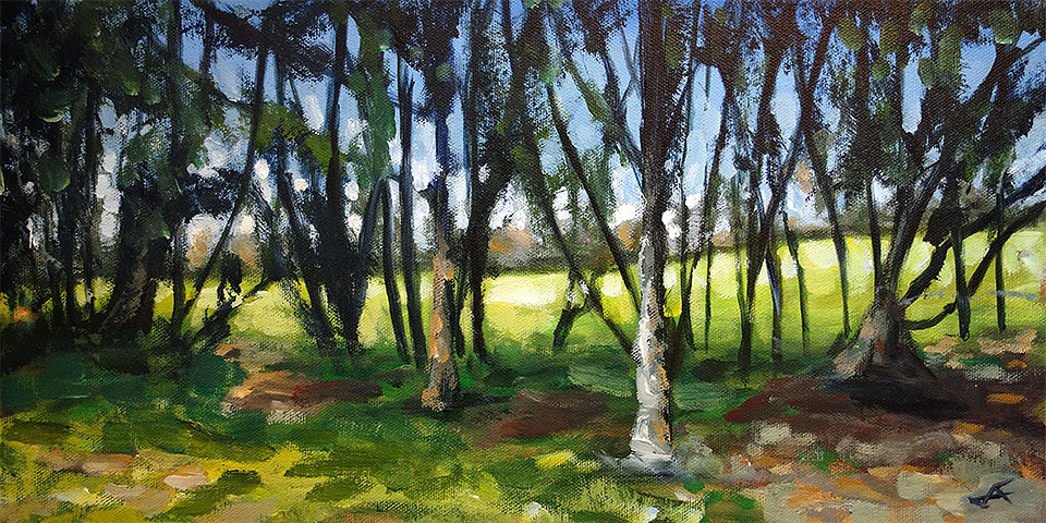
I haven't been painting a lot this year yet, because I've been drawing a lot and working on other design projects. And I've been observing and thinking, and a few things that I've learned in past workshops and books I've read have started to resonate and the concepts I'm learning in photography and design are having me look at my paintings (the ones that are still in my studio) with a new eye.

For example, I've always liked this little scene, because it reminds me of a happy place. But I think that since my mind memory fills in for where the painting fails, I was able to look at it objectively. 

Color and Value

So I put it against my checklist of what makes a painting work and how does one communicate what was intended and then made the necessary adjustments. No real changes to composition, but to color and value. Who was it that told me ages ago, that if you want something to look warmer, put some cooler colors nearby. Yeah, those kind of concepts are now resurfacing as I look at other painter's work and my own.

March 10, 2016

Concourse Trees (update)

Acrylic on Panel - 30 x 30 inches

Another update to a painting that never seemed quite finished. I added a tree in the foreground/right and lighted the cast shadows. I need to go paint this one on location sometime. My photo reference only hints at the great play of light that was really going on.

March 8, 2016

Panhandle Promenade (update)

Acrylic on Panel - 9 x 12 inches

I found this one lying around and thought I'd try and improve it a bit. For once it actually worked and I didn't ruin it. Just wanted to get some more color in the brightly lit areas.

January 28, 2016

Through the Trees

Acrylic on Canvas - 8 x 16 inches

One of my favorite things to do outside of painting is walking through the park. I see something different every day. This is my entry to the Daily Paintworks' "Escape the Snow" challenge.

January 8, 2016

Pantone Girl

Acrylic on Panel - 5 x 7 inches

My submission for this weeks Daily Paintworks 2016 Pantone Challenge. Pantone has named Rose Quartz and Serenity as the official colors for the year. In theory combining them can result in harmony and, well, serenity. I think I managed to come up with something almost disturbing.