April 4, 2016

Fruit Trees (update)

Acrylic on Panel - 6 x 6 inches
Original sketch.


Time to Reflect

I haven't been painting a lot this year yet, because I've been drawing a lot and working on other design projects. And I've been observing and thinking, and a few things that I've learned in past workshops and books I've read have started to resonate and the concepts I'm learning in photography and design are having me look at my paintings (the ones that are still in my studio) with a new eye.

For example, I've always liked this little scene, because it reminds me of a happy place. But I think that since my mind memory fills in for where the painting fails, I was able to look at it objectively. 

Color and Value

So I put it against my checklist of what makes a painting work and how does one communicate what was intended and then made the necessary adjustments. No real changes to composition, but to color and value. Who was it that told me ages ago, that if you want something to look warmer, put some cooler colors nearby. Yeah, those kind of concepts are now resurfacing as I look at other painter's work and my own.

March 10, 2016

Concourse Trees (update)

Acrylic on Panel - 30 x 30 inches

Another update to a painting that never seemed quite finished. I added a tree in the foreground/right and lighted the cast shadows. I need to go paint this one on location sometime. My photo reference only hints at the great play of light that was really going on.

March 8, 2016

Panhandle Promenade (update)

Acrylic on Panel - 9 x 12 inches

I found this one lying around and thought I'd try and improve it a bit. For once it actually worked and I didn't ruin it. Just wanted to get some more color in the brightly lit areas.

January 28, 2016

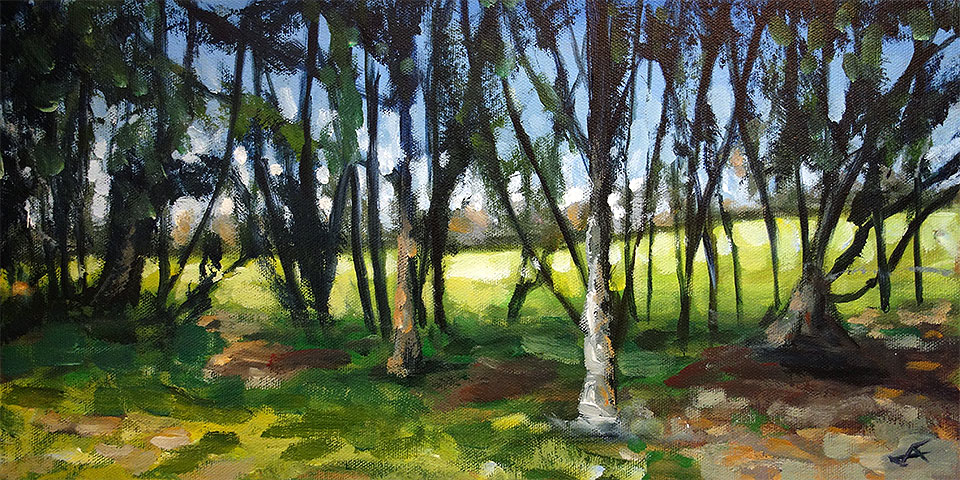
Through the Trees

Acrylic on Canvas - 8 x 16 inches

One of my favorite things to do outside of painting is walking through the park. I see something different every day. This is my entry to the Daily Paintworks' "Escape the Snow" challenge.

January 8, 2016

Pantone Girl

Acrylic on Panel - 5 x 7 inches

My submission for this weeks Daily Paintworks 2016 Pantone Challenge. Pantone has named Rose Quartz and Serenity as the official colors for the year. In theory combining them can result in harmony and, well, serenity. I think I managed to come up with something almost disturbing.

December 27, 2015

Bolinas Boats


Acrylic on Panel - 9 x 12 inches

I updated this one I found in the back hallway. It was so stark and edgy I decided to loosen it up a bit. You can compare to the original one if you like, but I wouldn't bother.

November 3, 2015

Yosemite Bridge

Acrylic on Panel - 8 x 10 inches

The Merced again. You can barely make out the old stone bridge crossing it. I had to hurry, because I sensed the mountain lion that had been spotted earlier was zeroing in on me.

November 1, 2015

Yosemite Morning


Acrylic on Panel - 8 x 10 inches

This was the view from the dining room at the Awanee. It seemed so simple and obvious to me as I was drinking my coffee, but somehow, it became really difficult to capture that simplicity.