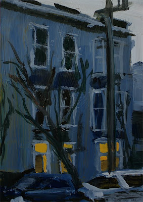
March 31, 2010

Davenport


Acrylic on Canvas Panel - 14 x 18 Ω
Took some good pictures on my last road trip, so I thought I'd try painting some of 'em. Trying to work bigger now. These are so easy for me on little postcards, but seeming impossible on larger panels. So I must push on.
I got interrupted after doing the initial sketch and blocking in of dark shapes. I did manage to get the sky started and take a photo. Tomorrow I'll get the basic color shapes in and then start refining them. And big brushes only!

March 28, 2010

Chyna IV


I didn't think there was enough contrast between the hills and her hair, which really should be the brightest, glowingest shiny part of the painting, so I added more blue to the hill colors, and darkened them a bit more. Ditto for the close face of the wall. I continued to round out the shapes of the arm, shoulder, legs and body. I added more detail to the shirt, and then suddenly felt like I had to try the stripes in the top. I would normally only hint at them or leave that kind of detail out altogether, but I thought it might help define the contours of the torso.

I think I'm essentially done here. If I were to do more, I'd probably lighten the sky and the water a bit more, but that's about it.


I think it looks a little darker here than in real life due to sloppy photography management. I really need to get a system and stick to it.

March 27, 2010

Chyna III


I've toned down the intensity of color and detail in the distant hills and brightened the water to reflect the tones in the sky. Then I refined the shapes in the dress and hair and skin to try and round them out. I think it's going in the right direction, but still afraid I'm getting too fussy. Maybe just an hour or so more and I'm gonna call this one.

March 25, 2010

Chyna II


Getting back to the project at hand...

Here I've blocked in the bigger color shapes to map things out and compare values. It's about as sophisticated as my finished painting from two years ago. I think the colors are a little more accurate than before, but I'm still trying to work out the focus and how to get that background to quiet down. I'll see what I can work out tonight.

March 23, 2010

Fountain


Acrylic on Cardstock - 4 x 6 inches

I did some more color work on Chyna, but had to interrupt the flow of postings, because I wanted to make sure to submit an entry to the Studio Atelier contest before the deadline ran out. You can see the source photo there and some great entries by other artists.

March 21, 2010

Chyna


Acrylic on Canvas Paper - 9 x 12 inches

I went back to a reference photo for a piece I did two years ago, and thought I'd try it again to see what my take on it might be now. The previous attempt was a 30 minute sketch, posted in August 2008.

This time I'm working a little bigger, and planning on taking more time. I want to focus on color values and the contrast in edges to direct the focus (as in not putting so much detail and sharpness into the distant hills).

As usual, I started with a sketch, in a mixture of ultramarine blue and burnt ochre, and then filled in the big dark shapes. Later, I'll block in the big color shapes.

March 18, 2010

Kaia Larger - III


Acrylic on Canvas Panel

So, based on my head studies and what I learned there, I decided to finish this piece.

I also reworked the colors in the legs and dress to make them appear rounder and not so high contrast.

It definitely looks like a better painting, at least in terms of accuracy. Unfortunately it seems to have lost any spontaneity in the figure. I kept using smaller and smaller brushes, and zooming in on my canvas. All this flies against what I've been trying to do with landscapes, probably because a sloppily rendered tree still looks like a tree, but I know this little girl and just wan't happy with the fact that it didn't look like HER.

Still it was fun, but took about 4 times as long as the usual paintings I've been doing. I think I'll try another and see if I can keep the loose qualities I like in play.

March 16, 2010

Kaia Larger - Head Studies


Photoshop analysis


Oil Pastel on Paper

With the geometry of the head in question, I decided to do some investigation into what I was having trouble with. Sometimes in situations like this, I photograph the painting, import it into Photoshop, and then superimpose the original photo. I run the photo through a "find edges" filter and render it in magenta, so I can overlay it and see where things are not checking out.

It's a pretty surreal image in and of itself. It also clearly shows where I've gone astray. The tilt needs to be more acute, the duck-tail smaller, and the nose/lip/lip definition needs to be indicated better.

I'm going to use these studies to inform me as I rework the face tomorrow. I sure learned something, I just hope I can apply it.


March 15, 2010

Kaia Larger II


Acrylic on Canvas Panel

Some have been clamoring to see some works in progress, probably for the enjoyment of watching me struggle, and this seems to fit well with one of my new goals, to work on longer, un-timed pieces.

I'm revisiting a piece I was not entirely happy with, Kaia at the Beach, from last August. You can see the old one at this link.

The water was too dark, there was no warmth in the skin tones, and the form looked rather flat. So here I've begun to address some of these issues. I kinda ran out of steam when it came to dealing with the face. More solutions to follow in that regard.

March 13, 2010

Page Window Abstract


Acrylic on Cardstock - 4 x 6 inches

I thought I'd zoom in on the window of the spooky Page House and create a detail/abstract. It's basically a repurposing of the already mixed palette, but I like how these often have the same mood and tone of the bigger pieces, without having much in the way of discernible content.

March 11, 2010

Page House


Acrylic on Cardstock - 4 x 6 inches

Kinda like the haunted house on Page Street. It was a rainy day, just before sundown, and this house was dark and blue, like other parts of the sky. But the part I liked was the warmth of the lit windows, naturally.

I really rushed through this sketch focusing on three things. Keeping the building dark, keeping brush strokes simple, and keeping the windows in line with each other. I've done a lot of quick sketches like this, but noticed that if the windows don't line up in some logical way, it's very distracting. I watched Heiner Hertling doing a barn on TV the other day, and the windows shapes were merely hinted at, but since they were aligned, the eye just took them in as "windows" without any trouble.

(I really like Hiener's PBS show, because he seems to be the only TV instructor that actually paints en plein air, painting a real landscape before him. All the others seem to be painting from a previous painting which bores me no end, and seems less instructive).


March 9, 2010

Mustard edit


Fantasy in Photoshop

This is more like the color you would have seen if you'd been in Sonoma last weekend. Still not quite right, but closer. I was a little rushed and lazy, and painting from bad photos, indoors, at night. Oh, I could go on.

The thing is this type of painting is all about the color, since there's not much to the composition. And I just plain got it wrong. Maybe time to try again. Hmmm.


Mustard


Acrylic on Cardstock - 4x6 inches SOLD

All along the highway in Sonoma, the mustard flowers fill the fields every Spring. The color on this is way off. They flowers are usually a bright yellow, but it was kinda overcast, and I don't think I did such a great job mixing the paint.

March 5, 2010

Agapanthus


Charcoal on Paper

Less scary than the spider looking palm.

Still not painting due to forces beyond my control.

Hopefully tomorrow.


March 3, 2010

Palm Sketch


Charcoal on paper

It's Wednesday, so that means it's Sketchbook Wednesday!

I'll spare you the whimpering excuses, but haven't been able to paint. Been sketching though. Painting to resume soon.