December 14, 2013

Lunch at Alamo Square

Acrylic on Panel - 11 x 14 inches - Click Here to Bid

This week's assignment for the Daily Paintworks' Challenge was to paint using the limited palette of Anders Zorn. Titanium Whie, Yellow Ochre, Cadmium Red and Ivory Black. Well, I don't really have those colors, and I thought I'd actually like it so much that I might move in that direction any way. So, along with white, I used by acrylic versions of Carbon Black, Pyrrole Red, and Hansa Yellow.

Well it was quite a different experience. I knew I could make greens with black and yellow, but what was going to do without blue? Well, they grey's I mixed with black and white wind up taking on a blue feeling, when seen next to the other warm colors. Wow.

With less paint choices, I think I actually made decisions faster and mixed colors faster. I think I really like this limitation. But I really miss having blue around.

As to the subject, I'm doing a series of images of Alamo Square, but trying to show it from unusual angles. I swore I'd never paint the cliché victorian "Painted Ladies" row, but I really liked the way this guy was sitting, almost perched on the shadow of a lamp post. So there.

December 13, 2013

At the Beach


Acrylic on Panel - 14 x 18 inches - NFS

These were for a commission for a dear friend of mine. Like the last one I did, I didn't get a chance to meet these kiddies and had to work from the only photo provided. That left me with the decision of how close to crop in. The top version was my initial plan, but someone looking over my shoulder suggested a pull-ed back version to show more of the sea. I tried to argue my case, but decided to shut up and just paint two. I'm not telling which one my friend picked.

November 19, 2013

Bike Man

Acrylic on Panel - 4 x 6 inches - Click Here to Bid

This is my entry for the "Bikeman Challenge" at the Daily Paintworks. Certainly an interesting source photo. I chose to crop way in and see if I could "hint" at the figure without putting in too much detail. My method – postcard sized panel and half-inch wide brush. Oh, and the kitchen timer (settings known only to me). 

October 27, 2013

Holding Hands

Acrylic on Panel - 11 x 14 inches - SOLD

This was a commission piece, and I didn't even know I did commissions. The father had seen some of my work, including a painting I did of a young girl dancing with her shadow. He sent me a photo that he thought would work well, and we was right, which is so rare. I prefer to take my own reference photos, but I knew I could make this work. I simplified the background a lot, but kept the figures pretty close to the reference. This practically danced off my brush, which is odd because I'd take a pretty long break from painting. 

October 25, 2013

Long Barn

Acrylic on Panel - 9 x 12 inches - Sold

Another one done on location up North where the weather is always warmer. 

October 23, 2013

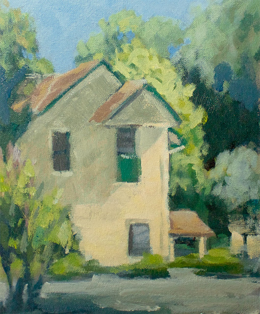
Sonoma House

Acrylic on Panel - 9 x 12 inches - Click Here to Bid

Painting on location in the countryside. Came across this interesting building and had a great spot in the shade to paint it. I tried to keep it loose and let a little of the underpainting peek through, and not pay too much attention to the details (and there were a lot of architectural details on this building). 

October 21, 2013

Thistle

Marker, colored-pencil, pastel, laserprint transfer - 6 x 4 inches - NFS

Here's my submission to the Daily Paintworks Touchy-Feely Challenge, which is about "texture" this week. I started with a photo of a thistle I took, output to laser and transferred to panel so I could attack it with all sorts of color and the scraping of the X-acto knife.

August 31, 2013

Notan Challenge

 
Acrylic on Panel - 5 x 7 inches - Click Here to Bid

This weeks Daily Paintworks Challenge was the Notan Challenge. You can read all about it there.
We were assigned to do a sketch first to unite the darks into a harmonious patter, and then do a painting based on that drawing.

This is a funky little building in my neighborhood, and I've painted it before, but not from this photo.
For some reason, I sketched in the tree on the left, but left it out of the painting. I was kinda rushed. I set the timer for 20 minutes on this one, but went over by about 5 minutes.


Hidden House

Acrylic on Panel - 7 x 5 inches - Click Here to Bid

This is the home of a local farmer. I liked how overgrown the property was. There are tended gardens all around, and fields that have been cleared, but right up against he house was lots of trees and bushes.


August 28, 2013

Lilly Pond

Acrylic on Panel - 8 x 10 inches - Sold

Not Giverny, but Sonoma. The light was changing rapidly so I tried to quickly capture the spots where it was still hitting the pond before it was too late. It was quite a bit shadier by the time we packed up, but I think I managed to convey what it looked like when we arrived.

August 25, 2013

Lemon Pickup

Acrylic on Panel - 6 x 6 inches - Click Here to Bid

This truck appeared out of nowhere while I was trying to paint the house!
Actually I think I've painted the house enough so I chose to paint the truck. It also positioned my conveniently in the shade of the garage. 

August 24, 2013

Faint Hills


Acrylic on Panel - 9 x 12 inches - Click Here to Bid

When we arrived to the location, it was hazy, like many mornings. I knew it would burn off if I waited a bit, but since I was already set up, I decided to try a quick sketch to capture the values of the distant hills while it was still faint.

August 23, 2013

Another "Fixer"


Acrylic on Panel - 9 x 12 inches - NFS

Well, I did it again, again. It's true I did improve some things, but overall, it's just less appealing. The distant trees look see-through now, and the shapes have all become fuzzy and less interesting. I definitely got fussy with the thing and lost it. I sure hope I'm learning something by these mistakes.

August 22, 2013

A Perfectly Good Example of Not Fixing Things


Acrylic on Panel - 9 x 12 inches - NFS
I spent the morning "fixing" a few paintings. Here's one I did last month, where I decided that it was too flat, as in not communicating the depth of field. So I tried to make the distant hills and trees less saturated, and made the foreground warmer. And I got rid of those pesky clouds. Result, something rather dull, and flatter.

Wow. How could I be so wrong, especially after all I've learned!

I think the original did have a few problems, but was probably more accurate in color, because it was painted on location.

Oh, it's just too painful to write anything more. Have fun comparing them as I go toss this one in the incinerator. 

July 8, 2013

Umbrellas

Acrylic on Panel - 5 x 17 inches - NFS

Back to the country for some more painting and some fireworks etc. Getting better at separating the greens and keeping it loose, but in photographing this next set, something interesting revealed itself. There was a swatch of orange on the backdrop I set these against, and when I viewed them in Photoshop before cropping, that orange really sang. Too bad I didn't manage to get any of it in the actual paintings.

I really think using an orange tone for priming the canvases would have helped me remember to get more of that tone in here.

Here's a faked version so you can see what I mean. It's not great, but it does hint at what could be.

July 1, 2013

Artist Studio Online Tour and Giveaways – A Blog Carnival

I don't really have a studio. I live in the most expensive city on Earth, so I paint in the kitchen/office/dining/living-room (and yes that's all one room). I also put away everything when I'm done, so there's really no studio. Just my pochade box on a tripod. The same setup in the home as in the field.

Marla Laubisch on the other hand has a great looking studio (pictured above) and has generously opted to share it with us along with 14 other artists. It really is an interesting tour, so check it out.

http://marlalaubisch.blogspot.com/2013/06/artist-studio-online-tour-and-giveaways.html

Marla LaubischCarol SchiffKaethe BealerJo MacKenzie
Michael ChamberlainCharleen MartinSally BinardJacklyn Karabaich
Sharon GravesSea DeanJohnna SchellingTaryn Day
Julie Ford OliverSarah SedwickKim RempelCindy Michaud
Joanne GrantCarmen BeecherCindy WilliamsCathy Engberg


Marla also has a giveaway painting for one lucky subscriber to her weekly newsletter, so get signed up and win!


June 30, 2013

Oak Fair Market

Acrylic on Panel - 9 x 12 inches

I had done a little postcard version of this that turned out so well, I'd been meaning to do a larger version, so here it is. I managed to keep it loose, despite the size and really had a lot of fun. Maybe I'll do an ever bigger version. Hmmmm.

A lot of things I learned while attending Brent Jensen's workshop kept coming back to me. I don't think I'm suddenly a much better painter, but I feel like I'm a much better informed painter. I mean I rendered a detailed victorian building without very many hard edges at all. Quite liberating, actually.

June 25, 2013

Laundry Day

Acrylic on Panel - 8 x 10 inches - Click Here to Bid

The last morning of the workshop, and things were a little cooler for a change. This one even looks a little cooler, but I think that's a coincidence.

I was looking for a scene to paint and suddenly the laundry went up and I couldn't resist. The resident came to look and was a little surprised to see me painting this scene. It was actually going pretty badly, and every now and again, he'd drop by to see the progress. Then in the last couple of minutes, it all came together and he was so pleased he offered to buy it on the spot.  I couldn't have asked for a better finish to the workshop.

June 24, 2013

Wine Hills

Acrylic on Panel - 8 x 10 inches Ω

OK, so, more of the greens are looking the same in this one.  Partly because I actually painted this one in the morning before the one I previously posted, partly because the photograph isn't really that good, and mostly because of old habits.  

June 22, 2013

Winery Sheds

Acrylic on Panel - 8 x 10 inches - Click Here to Bid

Day two of the workshop, and things are improving. Look how many green shapes I have and for once they aren't all the same color! This is looking a bit like the kind of Northern CA landscapes I actually like. Imagine that. 

June 21, 2013

Madrona Cottage

Acrylic on Panel - 8 x 10 inches  Î©

Still day one of the workshop, and another building at the Madrona Manor, from another vantage since the sun had moved. Actually I tried to be too clever with this one. The side of the building facing me was in total shade, but I knew it would eventually be in full sun. The problem was I underestimated how long it would take. I was already packing up when the sun did hit and I quickly rendered the shadow areas (I had already cheated in the sunlight facade, because I knew what color it was going to be).


June 20, 2013

Madrona Manor


Acrylic on Panel - 8 x10 inches  Î©

This is my first painting from the workshop. I was lucky enough to join my dad for a few days of instruction and demos with Brent Jensen.  He's a great plein air painter and has a nice, relaxed style. I learned a lot about mixing colors, especially the use of complimentary colors in toning down bright color. I think I'm finally able to banish black from my palette. Well, at least my plein air palette.

This is one of the many out buildings at the Madrona Manor, in Healdsburg, CA. It was quite hot the entire week, so I painted this from the refuge of the shady patio.

June 19, 2013

Casa Blanca

Acrylic on Panel - 8 x 10 inches - NFS

I just got back from my latest trip to Sonoma, and started off with a warm-up sketch of the house I was staying at. I'd gotten a bit rusty and wanted to make sure I didn't head off to the workshop completely cold. 

May 27, 2013

Kinley Drive

Acrylic on Panel - 8 x 10 inches - NFS

This seemed fairly accurate, color-wise while on location, but it just seems dull and flat now. Maybe it's because I'm back in fog town, but I don't think that's it. I've been painting indoors so much this Spring, that I haven't adjusted to painting outdoors. I'm gonna give this another pass and see if I can fix it before I list it for sale. The paint's pretty thin too, so I'll see if I can lay it on a bit thicker while I'm at it.


May 2, 2013

Princetown Farm

Acrylic on Panel - 9 x 12 inches - Click Here to Bid

I snapped the reference photo on the highway back from Half Moon Bay. I see this house every time, but I rarely have my camera at the ready. Just got lucky this time.

I just love that so many palm trees dot the landscape in California. They're not native, they have nothing to do with farming or wine making. But they do make me smile. 

April 30, 2013

Zebras

Cut Paper - 7 x 7 inches

Carol Marine post quite a photo for this week's Daily Paintworks "Crazy Making Challenge." (to see her source photo, follow the link).

Before getting into the paint, I took her advice and did a few quick sketches and then a detailed one the size I wanted to paint. The final sketch looked so much like stencil art to me that I decided not to paint the scene at all, and just construct it with paper. The blue sky is from a photo detail of another painting.

If I have time this week, I'll do a painting as well. We'll see.

April 28, 2013

Red Truck Revisited


Original (top image)


Update (bottom image)


Acrylic on Panel - 8 x 10 inches - sold


Here's another before/after post. I found this in the discard pile and thought I'd warm up the sunlight areas and fix a few other things. Again, like the last time I did something like this, I thought I was making big changes, and in the end it really didn't wind up looking all that different, but it is an improvement nonetheless.

April 26, 2013

Dairy Princesses

Acrylic on Panel - 8 x 10 inches - SOLD

I snapped this photo last year at the end of the 4th of July Parade in Sonoma. The dairy princesses vehicle had pulled off the road to cool off a bit. Damsels in distress for sure.

I dug up this reference photo to use for my submission to this week's Paint It White Challenge at Daily Paintworks. There's really a great crop of submission for this one, so be sure to check 'em out.

I rushed this one on purpose, to keep the paint a little wet and to try to not get bogged down in little details. Only the princess face gave me a bit of trouble and had to be touched up this morning.

In case it's not obvious, the red on their dresses is their official parade ribbons.

April 23, 2013

Corner Market

Acrylic on Cardstock - 4 x 6 inches - SOLD

This is a quick rendering of a building in the neighborhood. I started with a completely black background and tried to let it peek through in places. 

April 20, 2013

Sachi

Acrylic on Panel - 9 x 12 inches - NFS

This is a friend of mine from the neighborhood, though this picture was taken in the park a while ago. I thought it would be an easy loose one to do for the Daily Paintorks' Paint Your Friend Challenge.

Well, the initial blocking in was easy enough, but I wasn't getting the face right. It was a nice loose image of "a girl" but it wasn't looking like Sachi. I could have left it at that, but I really wanted to figure out why it wasn't working.

You see, if been going to figure drawing classes lately, and I'm learning so much about the figure that I really should know better.

In any case I kept at it. I took pictures in progress, brought them into Photoshop and compared them and kept reworking the face. The really weird part was, if I made an adjustment to the lips, it wound up looking more like her sister. If I changed the eye, it would look like her mother.

Finally, after much hair pulling (mine, obviously) I got as close as I'm gonna get, and it looks like her. I really didn't mind all the tricks I had to pull out to make this work, because I learned A LOT in the process.

Landscapes are so much easier than portraiture, but then you knew that.

April 12, 2013

Market

Acrylic on Panel - 8 x 10 inches - SOLD

Carol Marine's concept of a sunny farmer's market intrigued me, but last Sunday when I went to our farmer's market, yes, in San Francisco, it was far from sunny. Fortunately, it was still purdy.

This is my submission for the Daily Paintworks' Farmer's Market Challenge. I will endeavor to paint a sunnier version soon. It's only April in SF, and our real sunny Summer isn't until September.


April 6, 2013

Field House

Acrylic on Panel - 8 x 10 inches - Click Here to Bid

It's been pretty wet and yucky here this week, but I managed to get out and go to the Marina during a dry spell. This is one of the many military buildings that dot the Presidio and the Marina, and I chose this scene for the Daily Paintworks "Plein Air" Challenge.

I took lots of photos, so I'll probably be doing a bunch more of these.

March 30, 2013

Front Porch 2 (revisited)


Original (top image)


Update (bottom image)


Acrylic on Panel - 9 x 12 inches - Click Here to Bid


I found this one lying about in the back hallway and though I liked it, something wasn't quite right. I thought I'd try to learn what it was by "fixing" it. The changes are subtle, but I think it works a bit better. Other may disagree. Give me ten minutes and I might disagree myself.


March 29, 2013

Spring Comes to the Vineyard

Acrylic on Panel - 6 x 4 inches - Click Here to Bid

The Daily Paintworks "The Meaning of Spring" challenge has got to be one of the best attended challenges yet. It's only Thursday and there's already over 70 paintings there. Go have a look.

I guess Spring really resonates with artists. Either that or everyone's on Spring break.

I based this on a photo I took last year, while wandering around Sonoma on my way to Easter at my parent's place. I can't believe it, but it's Easter again. 

March 19, 2013

Fridge

Acrylic on Panel - 9 x 12 inches Î©

Here's my submission for the Daily Paintworks "What's inYour Fridge" Challenge.  I thought about composing the contents of my refrigerator, but then I was afraid I'd be there all day rearranging things with the door open. Instead I went for my first honest glimpse and took a photo.

I used more black in my mixing than usual, and I don't mind a bit.

March 15, 2013

N and J

Acrylic on Panel - 11 x 14 inches - NFS

Catching up with Daily Paintworks, the timing was great. I had this photo of some small people I know and I wanted to try just doing a value study of it. It just so happens that this week's challenge, the Monochrome Challenge, was to paint in a monochrome fashion using just three levels or values. I think I actually wound up closer to four: black, white, dark grey and light grey.

It's been a while since I've painted and this is a big panel and something I cared about, so I was afraid I'd choke up and get all nit-picky, but I got luck and stayed nice and loose.

February 2, 2013

Shore

Acrylic on Panel - 8 x 10 inches - Click Here to Bid

This is my submission for the Daily Paintworks "Non-dominant Hand" challenge. I did, indeed paint this using my left hand, which I thought would be easy, but was harder than I thought. What I didn't expect is that mixing was even more difficult. Who knew.

The subject is actually another painting. It was a lakeside village my father painted ages ago, and which hangs in my apartment. I was sitting in the increasing gloom last night and let my eyes go out of focus and I could see the buildings as rocks, so I thought, I'll interpret it that way and see what I come up with. I didn't do a lot of color evaluation since I was relying on a painting as my source, so I tried to keep it as close to that as possible. Naturally I failed there, but I did keep the general tone. 

January 26, 2013

Ruby Glass

Acrylic on Panel - 6 x 6 inches - sold

Oh, how I'd like to paint the challenges on Sunday as they are assigned, but I'm seem to be falling into my high school mode of turning in assignments at the zero hour.

This week's theme is (was) glass and you can see the other entries at Daily Paintworks.

I've painted this bit of glassware many times, but I thought of a novel lighting method, using a flashlight. It looked amazing in real life, less so in my rendering. Sadly, it really doesn't have many transparent areas, which is the real point in painting glass (and half the fun) but it gets the job done.

The contents of the glass are simply cubed ice, and cranberry juice. In a case like this, there's really no point in trying to ply the model with booze.

January 18, 2013

That Purple House

Acrylic on Panel - 8 x 10 inches Donated

It's been as close to freezing the past two weeks. Wearing sweaters and coats inside the apartment kind of weather. Today, it broke 60 and felt like Spring. I just had to go paint outside. In January! With no jacket either.

Just down the street is this little purple building that always pops out at me. I had to work fast because you could see the shadow of the building behind me creeping up.

Despite the sudden stage fright, (it's been a while) no one wanted to have a peek or offer any advice. See, there was nothing to worry about.

I wasn't too thrilled with the results when I got home, but now that I look at it, it doesn't really bother me much.

January 8, 2013

Glass Haus Watercolor

Ink and Watercolor on Paper - 10 x 14 inches - NFS

The first Daily Paintworks Challenge of the year is to "try something new." Though there are many things I've never tried, I tried to think of some visual media I had neglected. I was a recent tutorial on pen and ink drawings that were colored with watercolor. I've always liked this look in sketchbooks, but never have watercolors with me when I'm out sketching, so I thought I'd try it out at home.

I have some really nice watercolor paints, but the tubes are over twenty years old, so they were a bit stiff. I also didn't have any greens and for some reason couldn't mix one either (I know, yellow and blue, but it just turned out grey).

Disappointed, because it didn't turn out how I imagined it, but I'm not sure what I was expecting anyway. Maybe a lighter touch?