July 31, 2009

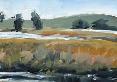
Pan Handle Study


Acrylic on Cardstock

I've still got a ton of great photos from Bay-to-Breakers this year (for non-SF people, it's an annual road race in SF, that has prizes for the fastest runners, and also for costumes. Folks 'round here like dressing up).

This is a quick study for piece I want to do of a woman in a ballerina costume, crossing through the park with her parasol. I think I may switch this to a vertical, so there's more figure and less landscape. I'll keep you posted.


Red Flag Big


Acrylic on Canvas

And here ends "abstraction week in Gringo-land." Well for now, I think.

At the suggestions of a few followers here, I did indeed try to replicate one of the postcards at a larger size. This one is 18x14 inches.

I skipped the palette knife, because it's really not big enough. Instead I used a 3-inch foam brush. I've seen Wyland do this a lot as an underpainting etc. but I gotta say, it's really a lot of fun.

I gave myself a very short window of time to enlarge this image. I think that helped, because it's very hard to go back over areas with a 3-inch brush, and I felt like I was pushing $2 worth of paint every time I made a swipe. "It's just paint, it's just paint, it's just ..."


July 30, 2009

Fire Water


Acrylic on Cardstock

Loosely based on something I saw on TV about a factory fire as seen across the bay.

July 29, 2009

Feather Fan


Acrylic on Cardstock

This is what happens when there's too much mixing going on. Mud.

July 28, 2009

War Feathers


Acrylic on Cardstock

Staying in the abstract mode and letting the brush dance where it will. I'm afraid this might have been influenced by listening to too much Adam and the Ants last night. Maybe not.

July 27, 2009

Red Flag


Acrylic on Cardstock

I'm getting a little tired of painting landscapes, so this week, I'm doing some more abstract work. This is based on a painting I did of a red book, but I did it from memory, trying to distill it down to just basic color areas. I kinda let the brush flow where it would, so it wound up looking more like a flag. So be it.


July 26, 2009

Golden Gate Hut


Acrylic on Panel

I took a pic of this while walking around in the park today. I think it's really a public bathroom, but not totally sure. I just liked the way the light was making it pop out of the scene.

I'm still using the limited 3 color palette and it seemed to work out fine, but then again, the sky color in the city is different than in Sonoma.

July 25, 2009

Landmark 3


Acrylic on Panel

OK. Last stab at this. This is really just an extension of yesterday's piece. I thought things had gotten too simple and that it lacked any real interest or flow, so I tried connecting some of those shadow shapes and making those vines a little more round and connected.

I also tried to add some detail to those back hills, without making them busy, and tried to put some more accurate color in them. I mean, the pale blue thing works, but really I saw more of that burnt straw in there.

July 24, 2009

Landmark 2


Acrylic on Panel

I decided to try this again, painting from a photo and incorporating what I had worked out in my field study. Wow, this is the kinda thing I've read about!

I also wanted to see if I could simplify some of the bigger shapes, like the trees, so that not everything had the same jarring brushstrokes that the field study had.

Well, what took two and half hours outside, took only 1 hr today. I don't think it's really any better, nor any worse. I'm also having a very hard time mixing the right greens, for the lightest parts of the vines. Some highlights are yellow, but some are a very pale, yet warm, green. I think I need to use a different blue to make that shade. That means adding to my limited palette. Oh, well.


July 23, 2009

Plein Air Artist


Acrylic on Panel - 9 x 12 inches SOLD

One of the great painters who attended the workshop (there were enough pros there to make me feel about two inches tall) set up to paint the train tracks. I couldn't face painting another barn or mountain ridge, so I thought this would be a fitting end to the weekend. My first plein air painting of a plein air painter.

I rushed through in about an hour and a half, and she liked it enough to take it home with her. That kind of compliment is better than any other kind of reward.

July 22, 2009

Landmark


Acrylic on Panel

Day two of the workshop. The paint was drying so fast yesterday that I decided to switch to a set of Golden Open Acrylics, but with temperatures nearing 100, I still had to add tons of medium and even water (I had my trusty spray bottle but even that was not enough) just to keep things fluid.

Every time I adjusted something on this piece, I made something else worse, or exposed a bigger area of trouble.

At the critique I got a lot of helpful tips on how I might "fix" this, and I thought, "yeah, right. I'm not putting another dab on this loser." However, when I got it back, I did follow the advice. I softened the mountain line, warmed up the vineyard ground, and got some deeper darks in the green shadows. I'm not saying I really rescued it, but it certainly served as a learning experience.

July 20, 2009

Bodega Harbor


Acrylic on Panel

Day one of Judy Butler's workshop in Sonoma. My generous father invited me on a two-day outing with one of the best plein air painters I know. Check out her stuff, it's truly outstanding.

We went to the seashore, but it was so foggy that "you couldn't see the seagulls" as it was said. So we moved to the tiny harbor of Bodega. Judy did a great demo of a rotting pier, and then turned us loose. The weather was changing dramatically minute by minute, so I thought I'd pick something nearby in case it got socked in completely I could still make out some basic shapes.

Well the shapes stayed put, but the light cycled through the entire spectrum. It was very challenging.

July 19, 2009

Snake


Acrylic on Cardstock - 4 x 6 inches SOLD

Getting some quick ideas down for some larger landscapes I might be doing.

July 18, 2009

Estuary


Acrylic on Cardstock - 4 x 6 inches   SOLD
Just a nice marshy scene I wanted to try.

July 17, 2009

Seated 2


Acrylic on Cardstock

To focus more on the actual shapes and negative spaces, I flipped the source image upside down and painted it that way. I think the dimensions and relative sizes are better than yesterday's, but I feel like the pose isn't as natural, and doesn't have any real weight to it.

July 16, 2009

Seated


Acrylic on Cardstock

Karin Jurick at DSFDF has us painting the figure again. I've never painted so many people!

The challenge she put to everyone was to get the figure right – the weight, the dimensions, the turns and curves – and not worry so much about the setting, and extraneous details.

For some reason I keep making peoples heads too big. I just keep putting more paint on and the edges seem to drift until the head becomes overly large. Instead of correcting this one, I'm gonna do another one manana.


July 15, 2009

On the Lawn


Acrylic on Panel

This is a new painting of the same subject (I painted this originally a few months back, May 16 and May 17). I wanted to see how differently it might turn out based on the things I've been cramming into my head, so I didn't look at the others until I was done.

I've definitely warmed things up quite a bit in the sunlit areas and kept the background stuff loose and a little cooler.

July 14, 2009

Ghost Truck


Acrylic on Canvas Panel

I started this scene, but didn't like what was going on with the truck, so I scraped it off a bit, and took a break.

Looking at it later I decided I kinda liked it this way. It's still immediately recognizable as a truck, and has that quality of both being there and not being there.

I'm gonna leave it like this for a bit, on the wall of my office, and see what happens to my opinion over time.

I'd love to hear your thoughts...

July 13, 2009

Tree Study


Acrylic on Cardstock

OK, this is one of the worst trees I've done in a while, but I was just playing with my new understanding of the warmer palette. Some of the motion in the brushstrokes is nice, but it's really just a failed sketch.

July 11, 2009

Metro Theater


Acrylic on Canvas Panel - 9 x 12 inches   SOLD
I've been meaning to do this one for ages. I just have to be in the mood to do night time scenes.
I was looking at the painting of the pier and, though I like the color, it seemed pretty rigid and I was wondering if there was to loosen up the brushwork even if it is an architectural subject. I think this subject works well for that approach, because I'm not really painting the building, but rather the light sources on the building and how the effect the various surfaces.

July 10, 2009

Pier 23


Acrylic on Canvas Panel

Back to my regular acrylics (saving the open ones for another landscape). I'd toyed with the idea of doing this for a while, but felt like I couldn't make a good composition of it. I finally decided I wouldn't worry about that so much, and instead concentrate on the contrast of the light and dark areas and trying to see how much information to include in the shadow areas.

July 9, 2009

Fairfax


Acrylic on Canvas Panel

I'm not entirely sure this is Fairfax, but it reminds me of Fairfax. I was going to crop in on the buildings, but then realized what I liked about this shot was the shadows of the trees across the road, and the fact that the buildings look so small against the mass of trees.

For paint I tried a new set I got of Golden Open Acrylics. I didn't immediately notice much difference, but when I went back to lay in new color on previously painted areas I found I was picking up a lot of the color underneath. This made it fun to paint and repaint the trees and shadows, though it took some adjusting from my normal style.

Also interesting, the following morning, some of the paint was still not completely set.

July 8, 2009

Sonoma Security


Acrylic on Canvas Panel (destroyed)
Well, I don't hate it, but it does bug me. Pretty much the same problem I had with the rower. This is only a 5 x 7 panel, so to do any real detail, I'd need a tiny brush, and I don't like using tiny brushes.
The problem is if I quickly gesture a few strokes, the colors look right, but the mind translates those strokes into actual facial expressions, making her look like she had a stroke. Scrub it out, try again, and now it's wrong, but just in a different way. I feel like I'd have to take endless attempts until I got the looseness I want and a set of features that don't shock or offend. I mean, in the photo she's an attractive woman.
I may try this again on a larger panel, but I'm afraid it'll be the same. I'll wind up getting all obsessed about the strands of hair or her earring and loose sight of keepin' it loose.

July 7, 2009

Sonoma Sketch


Acrylic on Canvas Panel

This is a quick color study, from a photo of a security guard at the 4th of July parade in Sonoma. She has long dark hair and big sunglasses. I'm really just posting this because I fear that when all is done, I'll still like this version better. We'll see.

July 6, 2009

Little Red


Acrylic on Card Stock SOLD
Finally a painting that isn't a red truck. OK, there's a lot that is technically problematic here (or just plain wrong) but was most interested in the colors on the hood of the car. I got close in places, but it really is tricky. The glare on the windshield is a little cartoonish.
Using my color isolator I could see that parts that I thought to be red were in fact orange, or tan, or purple. I just couldn't mix the right orange, tan or purple.
I suspect it makes a big difference which red you start with. I'm sticking with the limited 3-color palette for now, but may have to experiment with some other reds. (same with the blues I mentioned the other day).
Another observation – I remember Tim Horn saying that you need to be careful about the shadows when painting from photographs. They tend to push towards black, when really only the very darkest spots with no lighting at all should be that dark. So even though I started the dappled leave shadows quite dark, I went back and lightened them to a bluish-purple. Naturally they look darker here, thanks again due to photography.
In the afternoon, I walked around a bit and came across this car again, and sure enough, blue-purple shadows on the hood.

July 5, 2009

Merchant of Menace


Acrylic on Card Stock SOLD
I know what this looks like, but that's not what it was supposed to be. I was just practicing blending and layering with different consistencies of paint. Two big rectangular shapes.
Then it called out for something, so I put a blobby shape without much thought, right where the two rectangles met. It reminded me of a winged insect.
Then as I turned it around I realized I'd done a crappy seascape. I mean, boats don't look like that, and they certainly don't cast heavy solid shadows like that.
If only I had a tiny motel to hang this in.

July 4, 2009

Rower 4


Acrylic on Canvas Panel

This one is sort of a combination of what I learned doing the more abstract version, yesterday, with some of the more details versions I did earlier. Again, hard to leave the face alone, but I'm getting more used to it.

I was at a gallery last night that had two different artists work on display. One painted every tiny detail in the faces of his subjects. Even on a huge painting, if there was a figure only a few inches tall, the face would have every eyelash in place. They guy must have tons of tiny brushes.

Across the hall was another artist who painted quite large as well, but his figures had very little detail at all, and the faces where completely blank.

July 3, 2009

Rower 3


Acrylic on Canvas Panel

Not content with my attempts I decided to try a stripped-down version, with just the basic shapes. This is more in the direction I wanted in the first place. It's still hard to deal with that face mostly in shadow. If it was the side of a barn I could paint it in and leave it, but since I "know" there's a face there, and as humans, we all respond to faces, it's really hard to leave it be.

July 2, 2009

Resting Rower 2


Acrylic on Canvas Paper

I really wanted this to be a looser, more abstract version, but something about painting the human form makes me want to add detail. So I failed. It reminds me of some crappy watercolors I did many many years ago. Ugh.

I will try again.